QR Code Printing Best Practices: From Screen to Print
Everything you need to know about printing QR codes: file formats, resolution, color considerations, paper types, and common printing mistakes to avoid.
When Digital Meets Physical
On screen, your QR code looks perfect. Crisp edges, clean contrast. You send it to the printer, and when the stack comes back, something's off. The code scans inconsistently. Edges look fuzzy. Or worse—it doesn't scan at all.
The gap between digital preview and printed reality trips up a lot of people. Here's how to bridge it.
File Format Selection
Not all formats are created equal for print.
PNG – Best for most printing. Raster format with crisp edges and no compression artifacts. Use a high enough resolution (see below). This is what Snapkit provides by default.
SVG – Ideal for large-format printing. Vector format scales infinitely without quality loss. If you're printing banners, billboards, or vehicle wraps, SVG ensures the code stays sharp at any size. Learn more about SVG QR code benefits.
PDF – Good for professional printers. Can embed vector or high-res raster. Many print shops prefer PDF for precise control over output.
Avoid JPG – JPEG compression introduces artifacts that can interfere with module detection. A slightly blurred edge can break scanning. Stick to PNG, SVG, or PDF.
Resolution Requirements
For print, 300 DPI (dots per inch) is the standard minimum. That means each inch of your printed QR code should be represented by at least 300 pixels.
Calculate it: if your QR code will print at 2 inches × 2 inches, you need at least 600 × 600 pixels. For a 1-inch business card code, 300 × 300 minimum. Going higher rarely hurts; going lower risks soft, unscannable output.
When you download your QR code, choose the highest resolution available for your target print size. If you're unsure, err on the side of larger—you can always scale down, but scaling up a low-res file creates blur.
Color Considerations
QR code scanners rely on contrast. They need to distinguish dark modules from light ones. The greater the contrast, the more reliable the scan.
Best: Dark foreground (black, navy, dark gray) on a light background (white, cream, light gray). Classic and foolproof.
Acceptable: Dark colors on white with sufficient contrast. See our design guide for safe color combinations.
Avoid:
- Light on light (cream on white, pale blue on white)
- Low contrast (gray on gray)
- Gradients within the code pattern (can confuse module detection)
- Inverted schemes (light modules on dark background) unless you've tested thoroughly—some scanners struggle with these
For professional printing, designers often convert to CMYK. Ensure the contrast holds in the final color profile. A "black" that prints as a muddy brown can reduce reliability.
The Quiet Zone
Every QR code needs a quiet zone—a margin of the background color around all four sides. This border tells the scanner where the code ends. Without it, nearby graphics or edges can interfere with decoding.
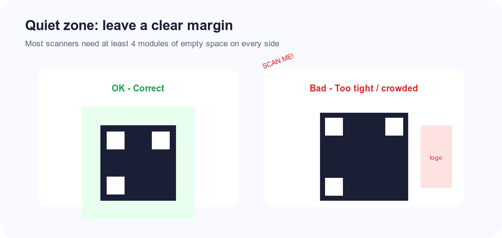
The quiet zone should be at least 4 module widths on each side. When preparing files for print, don't crop the code tight to the edge. Leave that white (or background) space. Check our size guide for more on this.
Paper and Material Selection
Matte vs glossy: Matte paper often scans better. Glossy surfaces can create glare under certain lighting, though many gloss prints work fine. If you're printing for outdoor or bright environments, matte reduces reflections.
Outdoor use: If your signage will face sun, rain, or handling, consider:
- UV-resistant laminate or coating
- Weatherproof substrates (corrugated plastic, metal)
- Lamination to protect the printed surface
Reflective materials: Avoid printing QR codes on highly reflective surfaces. Glossy metal or mirrored finishes can confuse cameras. If you must use them, test extensively.
Common Printing Mistakes
Printing too small. The minimum size for handheld scanning is about 0.8 inches. For distance, scale up. Small codes are the top cause of scan failures.
Cutting into the quiet zone. Bleed, trim, and layout can accidentally crop the margin. Ensure your print file preserves the required border.
Low contrast colors. A "styled" QR code that looks great on screen may fail in print if contrast is too low. Test before a large run.
Using low-resolution files. That 150 × 150 pixel image might look okay on screen. At 2 inches print size, it's 75 DPI—too soft for reliable scanning.
Wrong format for the job. JPG for a fine-detail code, or a tiny PNG for a billboard. Match format and resolution to your use case.
Testing Workflow
Before committing to a large print run:
- Proof print at actual size. Don't judge from screen. Print a single copy at the exact dimensions you'll use.
- Scan with multiple devices. iPhone and Android. New and older models if your audience might use them.
- Test in real conditions. If it'll be on a wall, scan from where people will stand. If it's on a table tent, scan from across the table.
- Check for common scanning issues. Fix any problems before scaling up.
A small test run is cheap insurance against hundreds of unusable pieces.
Get the print right the first time. Create your QR code with Snapkit, download in high resolution, and follow these practices for reliable scans every time.
Ready to create your QR code?
Try Snapkit's free QR code generator - no signup required.
Generate QR Code