Why Won't My QR Code Scan? 7 Common Design Mistakes
Frustrated by a QR code that won't scan? Here are the seven most common mistakes that break QR codes, plus how to fix each one and create codes that work every time.
When QR Codes Refuse to Cooperate
You've designed what you think is a beautiful QR code. You print it, point your phone at it, and... nothing. Or worse, your phone keeps trying and failing, dancing around the code like it almost recognizes something but can't quite get there.
I've seen this frustration play out countless times. The good news? QR scanning failures almost always come down to a handful of fixable design mistakes. Let's walk through the seven biggest culprits.
Mistake #1: Not Enough Contrast
This is the number one reason QR codes fail. Full stop.
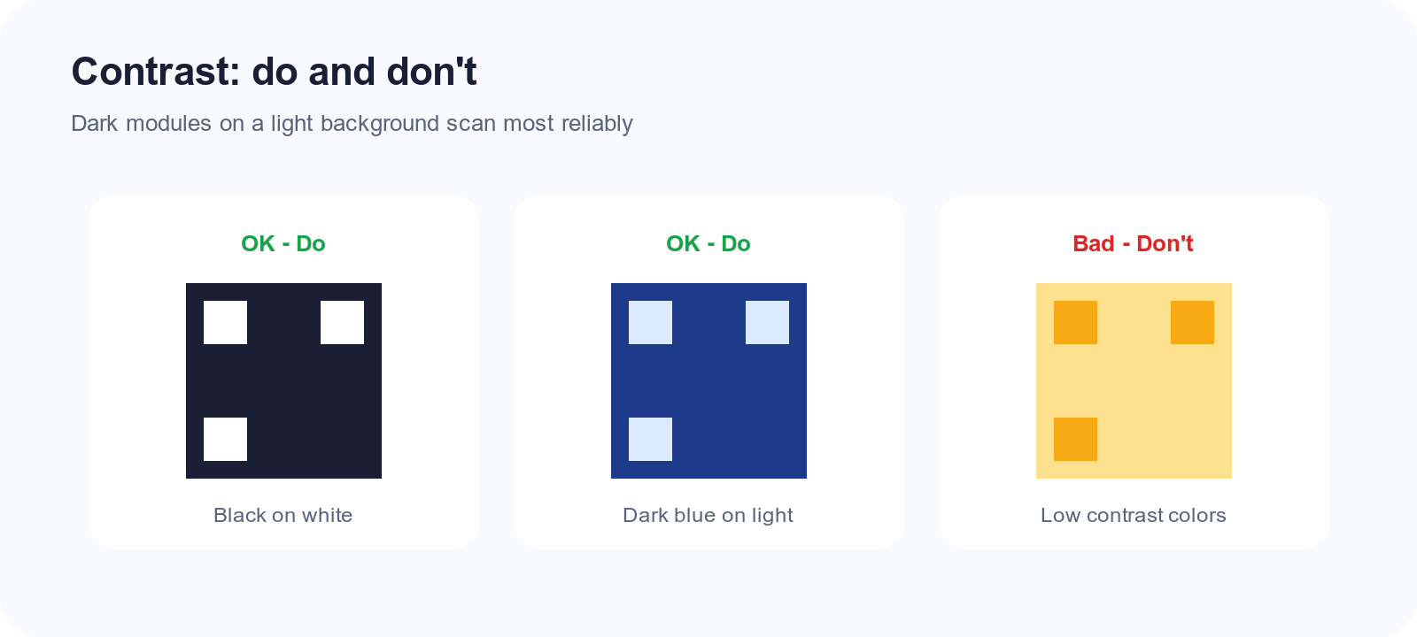
QR scanners work by detecting the difference between light and dark areas. When your foreground and background colors are too similar, the scanner can't distinguish the pattern. It's like trying to read gray text on a slightly different shade of gray—technically possible in perfect conditions, but unreliable.
What goes wrong:
- Navy blue on black? Not enough contrast.
- Yellow on white? Way too similar.
- Light gray on medium gray? The scanner will struggle.
The fix: Stick to high-contrast combinations. Classic black on white works for a reason—it's essentially maximum contrast. If you must use colors, keep the foreground dark and the background light, and test extensively before printing.
A good rule of thumb: squint at your code. If the pattern becomes hard to distinguish when you squint, it'll be hard for scanners too.
Mistake #2: Printing Too Small
Every QR code has a minimum size for reliable scanning, and that minimum depends on how much data you've encoded.
The more information packed into a QR code, the more tiny squares (called "modules") it contains. Each module needs to be large enough for a camera to resolve clearly. When you shrink the overall code, those modules get smaller, and eventually, they become indistinguishable blobs.
Typical minimum sizes:
- Simple URLs (under 30 characters): about 2 x 2 cm (0.8 x 0.8 inches)
- Medium URLs (30-60 characters): about 3 x 3 cm (1.2 x 1.2 inches)
- Long URLs or text: 4 cm or larger
The fix: Start with the shortest URL possible. If you're linking to https://www.yourcompany.com/products/2026-spring-collection-limited-edition-blue-widget, that code will need to be huge. A shorter URL like yoursite.com/spring26 encodes faster and prints smaller.
Also, consider where the code will be scanned from. A code on a billboard needs to be readable from 20 feet away—that requires a much larger print than a code on a business card viewed from 6 inches.
Mistake #3: Inverted Colors
Traditionally, QR codes are dark modules on a light background. Flip that—light squares on dark—and you're asking for trouble.
Most modern scanners can handle inverted codes, but "most" isn't "all." Older phones, certain third-party scanner apps, and cameras in unusual lighting conditions struggle with inverted patterns.
The fix: Keep it traditional. Dark foreground, light background. If your design absolutely requires a dark background, make sure the QR code sits on a light-colored section or has a white border (quiet zone) around it.
Mistake #4: Missing or Insufficient Quiet Zone
The "quiet zone" is the blank margin around a QR code. It might look like wasted space, but it's actually critical.
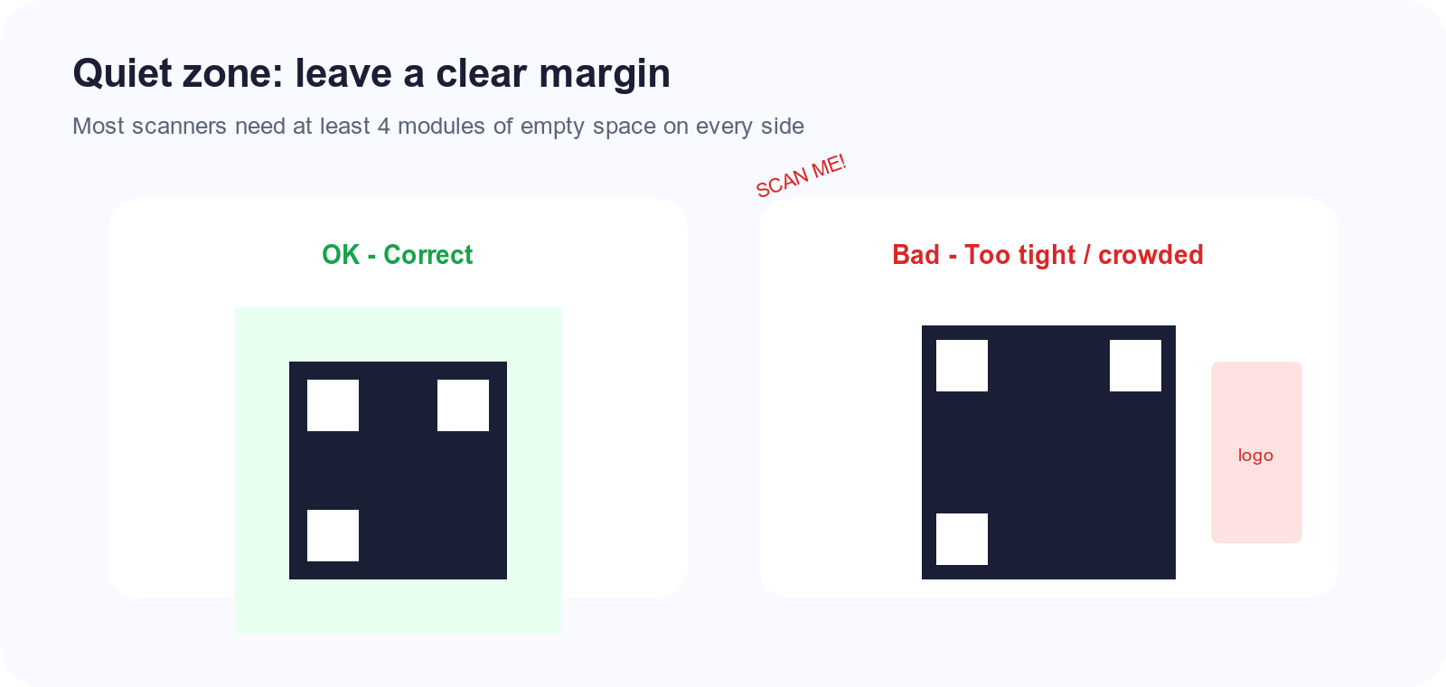
Scanners need that empty border to identify where the code starts and ends. When other design elements crowd right up against the code—text, images, decorative patterns—the scanner gets confused about what's part of the code and what isn't.
Standard recommendation: Leave at least 4 modules' worth of blank space on all sides. In practical terms, that's roughly 10-15% of the code's width as margin.
The fix: Don't let anything touch your QR code. No text overlapping it, no decorative borders hugging the edges, no background patterns bleeding into the quiet zone. Give it room to breathe.
Mistake #5: Low-Resolution Images
This one bites people when they download a QR code, shrink it for a document, then blow it up for a large print job.
QR codes are fundamentally pixel-based (unless you're using a vector format like SVG). When you scale up a low-resolution code, those crisp edges become fuzzy. Scanners depend on sharp edges to detect module boundaries, so fuzziness kills reliability.
The fix: Always start with the highest resolution source possible. If you're generating a code for print, make it larger than you need, not smaller. Better yet, use an SVG file that scales infinitely without quality loss.
When exporting for print, aim for at least 300 DPI at the final print size. A code that looks fine on your screen might be disastrously blurry when printed on a poster.
Mistake #6: Too Much Data Density
QR codes can technically hold up to about 3,000 alphanumeric characters. But just because you can doesn't mean you should.
The more data you cram in, the more complex the pattern becomes. More complexity means smaller modules, tighter tolerances, and more ways for things to go wrong. A code encoding a short URL is far more robust than one containing three paragraphs of text.
The fix: Keep encoded content minimal. For URLs, use the shortest possible path. Skip unnecessary tracking parameters when you can. If you need to share lots of text, link to a webpage containing that text instead of encoding the text directly.
Mistake #7: Damaged Quiet Patterns
Those three big squares in the corners of every QR code? They're called finder patterns, and they're non-negotiable.
Scanners use finder patterns to locate and orient the code. Damage or obscure even one of them, and the scanner can't establish its bearings. Some people get creative and try to blend logos over these corners or apply design elements that partially cover them—it's almost always a mistake.
The fix: Never cover or modify the three corner finder patterns. If you want to add a logo, place it in the center of the code, not touching the corners. QR codes have built-in error correction that can compensate for a central obstruction, but corner damage is much harder to recover from.
Debugging a Stubborn Code
If you've checked all seven issues and your code still won't scan, try this diagnostic process:
-
Test with multiple phones. If it scans on newer phones but not older ones, you've probably pushed the limits of color contrast or size.
-
Test in different lighting. Glare, shadows, and low light all affect scanning. If a code only works in perfect lighting, the design is too fragile.
-
Compare to a known-good code. Generate a simple black-and-white code with minimal data. If that scans fine but your designed version doesn't, isolate what's different.
-
Print a test at actual size. Screen previews can be deceiving. What looks crisp on a retina display might blur on paper.
Creating Reliable Codes from the Start
The best way to avoid scanning problems is to start simple. Use high contrast, keep URLs short, don't crowd the quiet zone, and test before you commit to a large print run.
Snapkit generates clean, high-contrast codes optimized for reliable scanning. But even the best generator can't save a design that violates the fundamental rules. Respect the technical constraints, and your codes will scan every time.
Ready to create your QR code?
Try Snapkit's free QR code generator - no signup required.
Generate QR Code