The Art of Colored QR Codes: Design Tips That Actually Work
Learn how to customize QR code colors without breaking scannability. Discover contrast ratios, color combinations, and design best practices.
Beyond Black and White
QR codes don't have to be boring black squares on white backgrounds. With the right approach, you can create colorful, branded QR codes that remain perfectly scannable. The key is understanding why certain designs work and others fail.
The Science of Scannability
QR code scanners work by detecting contrast between light and dark modules. They don't actually see "black" and "white" - they see "darker" and "lighter" relative values. This opens up significant creative possibilities.
The Golden Rule: Contrast Is King
The minimum recommended contrast ratio for QR codes is 4:1, but aiming for 7:1 or higher ensures reliable scanning across all devices and lighting conditions.
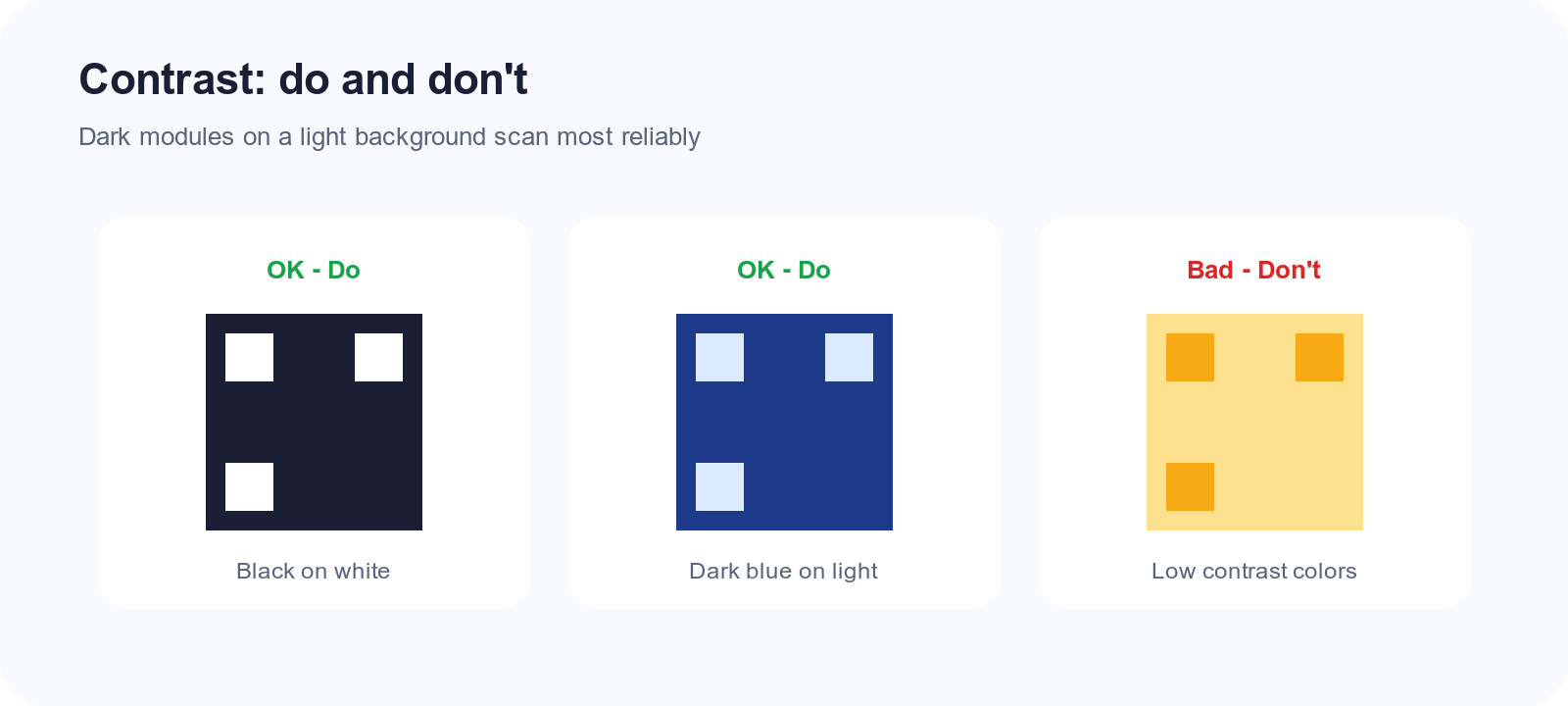
Here's what works:
- Dark foreground on light background: The classic approach
- Light foreground on dark background: Inverted colors work fine
- Saturated colors with sufficient value difference: Navy on cream, forest green on white
And what doesn't:
- Yellow on white: Insufficient contrast
- Red on green: Color-blind users can't distinguish them
- Light gray on white: Too subtle for reliable scanning
- Gradients across modules: Confuses the scanner's edge detection
CMYK vs RGB: Print and Screen Pitfalls
Designers often pick colors in RGB (screens) then send files to CMYK presses. QR modules are unforgiving—small shifts can erase contrast.
| Issue | RGB workflow | CMYK / print reality |
|---|---|---|
| Bright brand red | Looks vivid on monitor | Can darken toward brown; test swatch |
| Light blue background | Clean on screen | May look gray on uncoated stock |
| Neon / fluorescent | Possible in UI | Often outside printable gamut |
| Pure black modules | #000000 | Rich black (CMYK mix) can blur edges |
| White background | #ffffff | “Paper white” varies by stock |
Rules: Export print files with foreground/background as solid spots or simple CMYK builds. Avoid RGB-only PDFs for packaging. Request a physical proof and scan the printed code, not the PDF on screen. Pair this with the QR print guide for DPI and quiet-zone specs.
Color Combination Guide
Safe Combinations (High Contrast)
| Foreground | Background | Notes |
|---|---|---|
| Dark Blue (#1a365d) | White (#ffffff) | Professional, trustworthy |
| Forest Green (#276749) | Cream (#fffaf0) | Organic, natural feel |
| Deep Purple (#553c9a) | Light Gray (#f7fafc) | Creative, modern |
| Charcoal (#2d3748) | Pale Yellow (#fefcbf) | Warm, inviting |
| Black (#000000) | Brand Color (light) | Maximum reliability |
Risky Combinations (Test Thoroughly)
| Foreground | Background | Risk Factor |
|---|---|---|
| Red (#e53e3e) | White (#ffffff) | May struggle in low light |
| Orange (#dd6b20) | Cream (#fffaf0) | Borderline contrast |
| Teal (#319795) | Light Blue (#ebf8ff) | Similar color family |
Accessibility and Color Vision
Scanners measure luminance; color vision deficiency breaks pairs that look distinct to you but share similar brightness. Avoid red/green module/background combos; prefer dark-on-light with strong value difference. Add a text CTA (“Scan here”) and keep a high-contrast alternate for print when brand hues are risky.
Branding Your QR Codes
Matching Brand Colors
Want to use your exact brand colors? Here's the process:
- Check contrast ratio: Use a tool like WebAIM's contrast checker
- Adjust if needed: Darken or lighten colors to achieve 4:1 minimum
- Test extensively: Scan with multiple devices in various lighting
- Have a fallback: Keep a high-contrast version for critical applications
Logo Integration
Adding a logo to your QR code requires careful consideration:
- Use high error correction (Level H): This allows up to 30% of the code to be obscured
- Keep logos centered: The error correction is optimized for central damage
- Size matters: Logo should cover no more than 20-25% of the QR area
- Simple is better: Detailed logos may interfere with nearby modules
- Test, test, test: Every logo/QR combination should be verified
Logo + Color Combo Rules
Logo and color customization stack risk—each eats error correction and contrast.
| Element | Safe practice | Risky practice |
|---|---|---|
| Logo size | ≤20% of code area, simple mark | Full-color photo in center |
| Logo colors | Flat fill, contrasts with modules | Logo hues match module color |
| Module color | Dark brand color on light field | Mid-tone on mid-tone |
| Error correction | Level H when logo present | Level L with logo + gradient |
| Quiet zone | Solid light border, no logo bleed | Pattern extends into margin |
| Version | Static high-contrast backup for print | One “hero” file for everything |
When the logo is dark, keep modules darker still—or place logo on a white inset so modules stay uniform around it.
Lighting and Environment Testing Matrix
A code that passes at your desk may fail on a storefront window. Use this matrix before sign-off:
| Environment | What goes wrong | What to test |
|---|---|---|
| Bright sun / glare | Reflection washes modules | Scan at 10am and 3pm outdoors |
| Dim bar / restaurant | Camera boosts noise | Scan from seated distance |
| LED screens | Moiré if code is on display | Native camera + Google Lens |
| Gloss laminate | Hot spots on dark modules | Angle phone 15–30° |
| Uncoated kraft | Ink spreads, contrast drops | Press proof on actual stock |
| Colored product (e.g. bottle) | Background isn’t true white | Stick code on solid label zone |
| Distance signage | Modules too small | Follow size guide |
Mark pass/fail per device (iOS + Android). One failure = adjust colors, size, or background—not “hope it’s fine.”
Snapkit: Customization vs Free Static
Free static QR on Snapkit encodes data once—no redirect dependency. Ideal for print; see static vs dynamic. Customization changes how modules look, not the rules: contrast and quiet zones still apply. Dynamic QR can update URLs (tracking) but won’t fix a low-contrast palette.
Printable Brand Checklist
Before bulk print or vendor handoff, confirm:
- Foreground/background contrast ≥ 4:1 (target 7:1)
- CMYK or spot colors defined; RGB-only file rejected
- Quiet zone clear on all four sides
- Logo ≤25% area, Level H if logo present
- No gradients, shadows, or rounded modules breaking edges
- Minimum physical size met for scan distance
- Physical proof scanned (not just PDF on screen)
- CVD / low-light check on proof
- Backup high-contrast asset archived
- Destination URL live and HTTPS-safe
Common Mistakes to Avoid
1. Inverting Without Checking
Just because your colors look different doesn't mean they have sufficient contrast. A dark red (#8b0000) on dark blue (#00008b) might look distinct to your eyes but will fail scanners.
2. Forgetting About Print
Colors that work on screen may not translate to print:
- CMYK conversion can shift colors
- Paper texture affects scanning
- Glossy finishes can create glare
- Always test printed codes before mass production
3. Over-Designing
The temptation to make QR codes "pretty" can compromise function:
- Avoid rounding corners too much
- Don't add decorative elements that touch modules
- Keep quiet zones (white space borders) intact
- Resist the urge to add gradients or shadows
4. Ignoring Context
A QR code that works in your office may fail elsewhere:
- Outdoor codes face sun glare and weather
- Codes on screens compete with reflections
- Textured surfaces can distort the pattern
- Distance affects minimum module size
Testing Your Colored QR Code
Before deploying a colored QR code, run through this checklist:
- Multiple devices: Test on at least 3 different phones (iOS and Android)
- Various apps: Native camera, Google Lens, dedicated QR apps
- Lighting conditions: Bright light, low light, artificial light
- Distances: Close up, arm's length, across the room
- Print test: If it will be printed, test the physical version
- Accessibility: Have someone with color vision deficiency test it
Practical Tips Summary
- Maintain 4:1+ contrast ratio between foreground and background
- Dark on light is safer than light on dark
- Avoid similar hues - value difference matters more than color difference
- Test before deploying - always verify scannability
- Keep the quiet zone - don't crowd the edges
- Use Level H error correction when adding logos
- Print tests are essential for physical deployments
Create Your Custom QR Code
Ready to put these principles into practice? Snapkit lets you customize your QR codes with confidence. Start with our generator and create codes that are both beautiful and functional!
Ready to create your QR code?
Try Snapkit's free QR code generator - no signup required.
Generate QR Code